International Olympic Committee | Brand Evolution
∞
Objective: Crystallize the fundamental elements of the world’s most recognized brand.
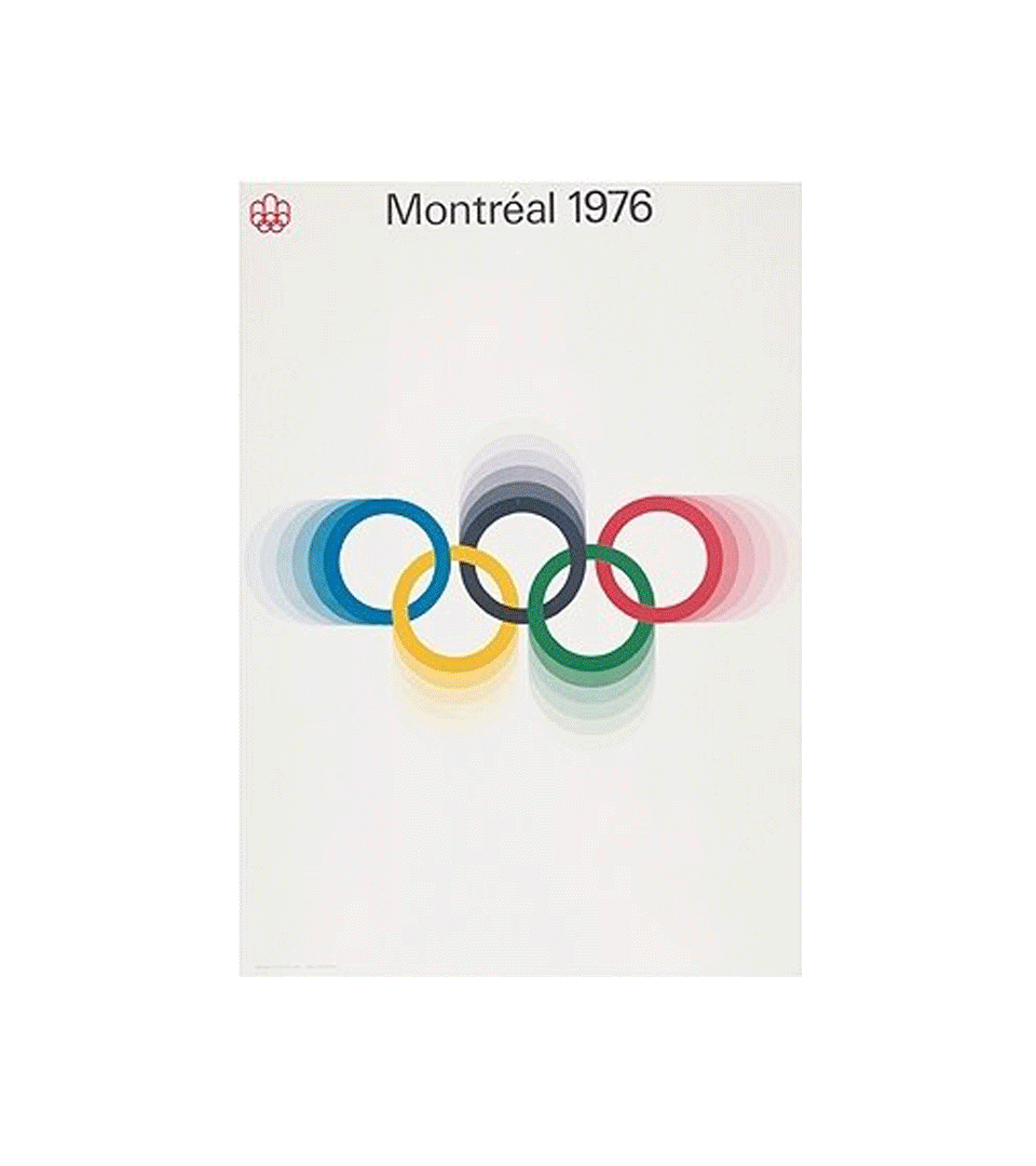
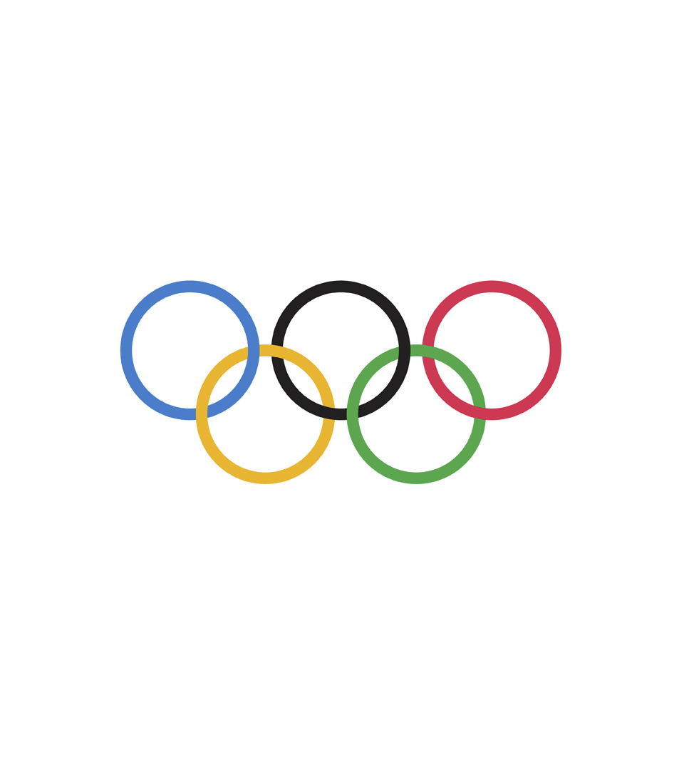
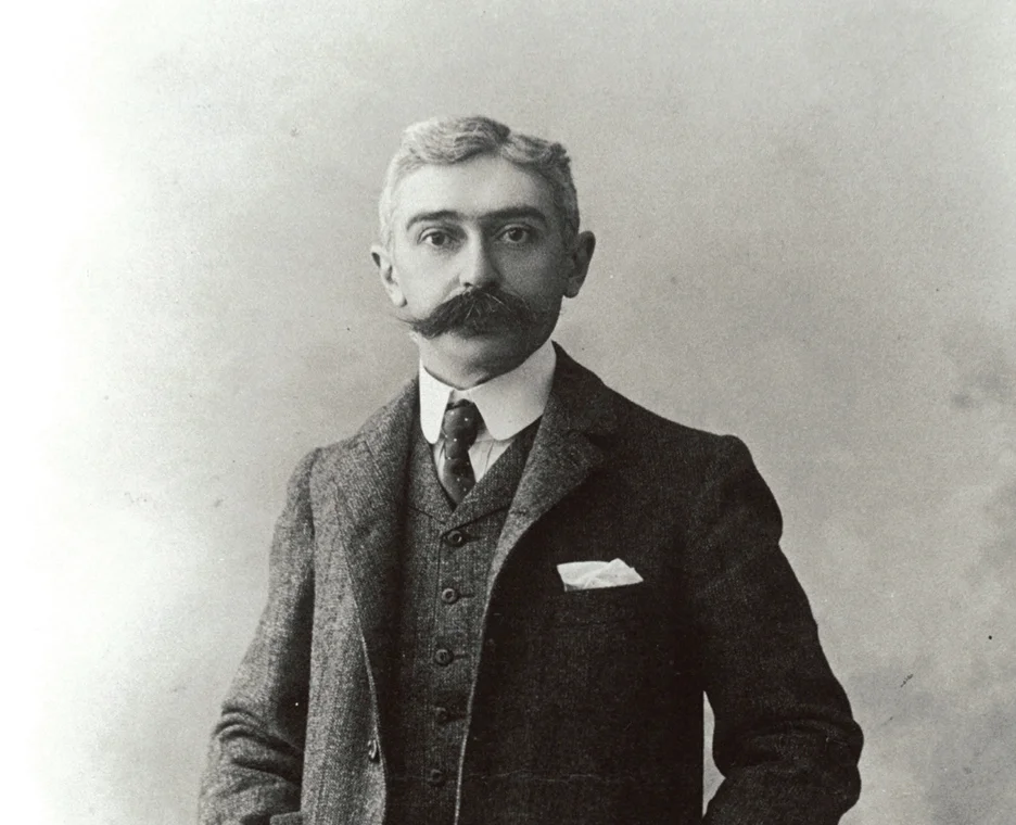
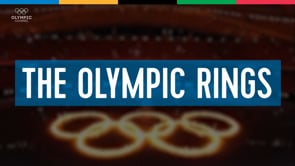
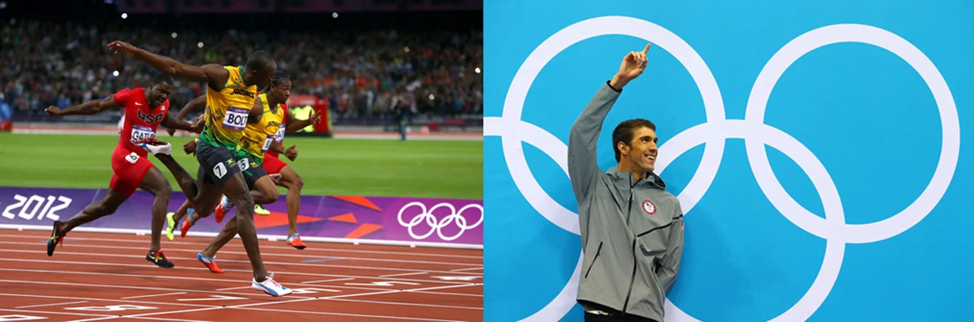
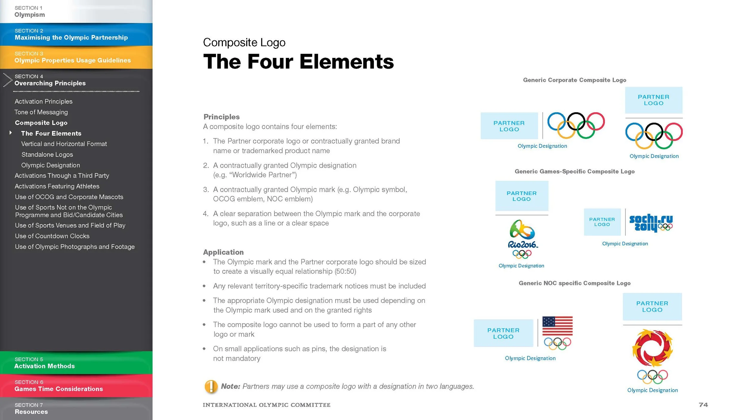
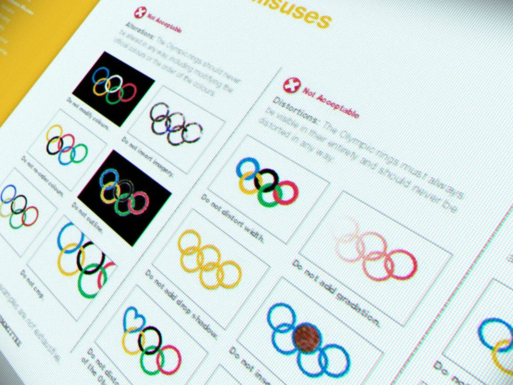
Approach: As part of a comprehensive effort geared to uphold the simplicity, integrity and visibility of the Olympic Symbol, the design of the Olympic rings artwork was restored to Pierre De Coubertin’s original intent. Standards were then created that govern the rings’ use across the IOC’s complex brand architecture—from the IOC’s corporate identity, to its products, programs, events, federations, sponsors and partners. Of major importance was the development of a custom typeface titled Altius, which is now the new IOC type standard. Standards had to strike a delicate balance between maintaining the identity’s integrity while allowing for the flexibility necessary to accommodate its many global uses, ensuring that however and with whatever the Olympic brand is used, it remains the singular visual beacon for Olympism worldwide.
Scope: Symbol (refinement), brand hierarchy, original typeface, templates, digital and broadcast guidelines, The Olympic Partner (TOP) sponsor guidelines